

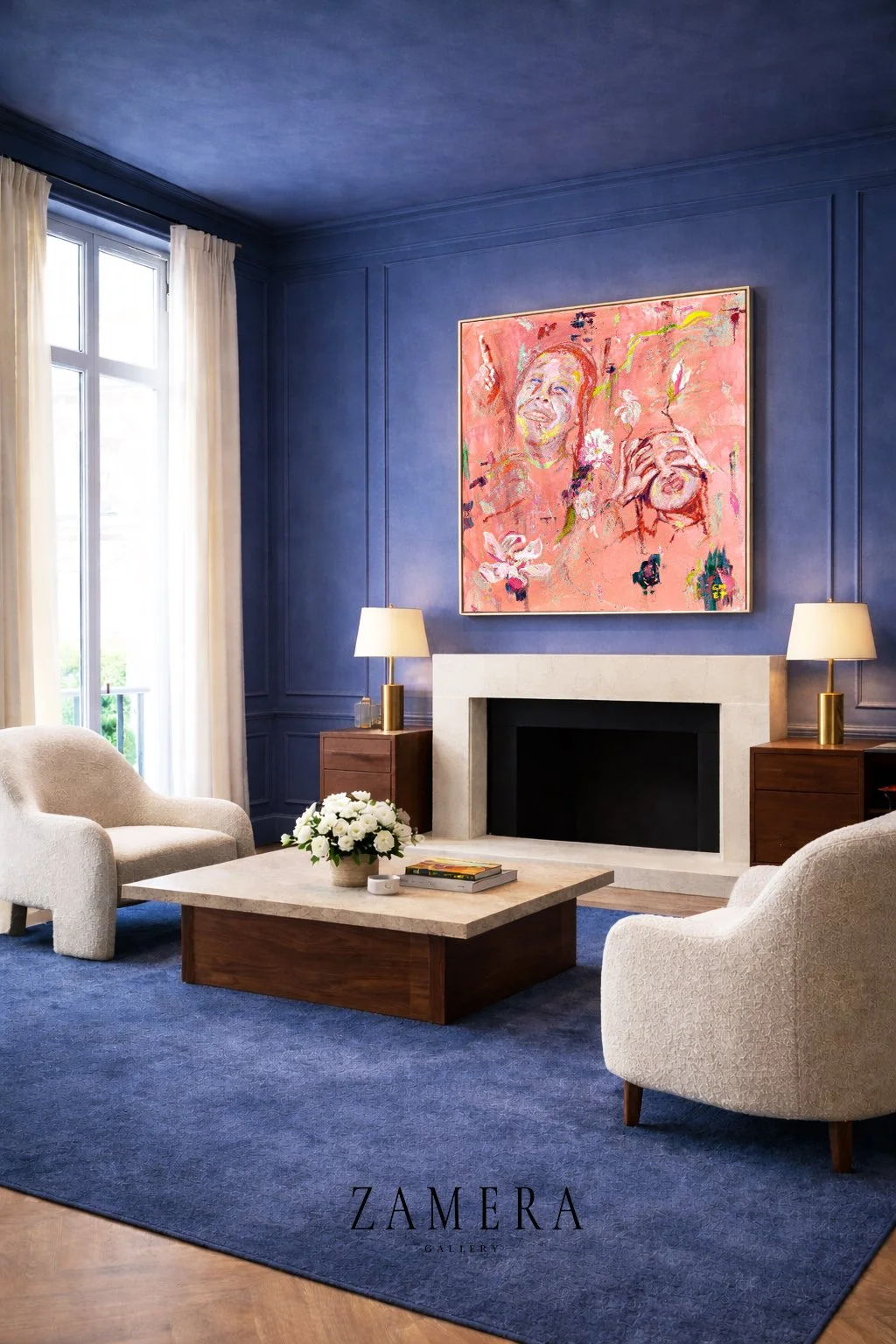
Color Envelope Study 02 — Adar
Explore how Adar Orange Burst anchors a contemporary living room with indigo walls, complementary color theory, and refined interior architecture.
Orange Burst
Color Envelope Series | Interior Architecture | Art & Space
A Living Room Study in Vitality and Warmth
Last week, we explored how Adar — Verdant Joy transforms an entrance into a threshold—a gentle moment of arrival where luminous greens and tender pinks create space for renewal.
This week, we move deeper into the home.
Where the entrance whispers welcome, the living room speaks presence.
At its heart: Adar — Orange Burst.
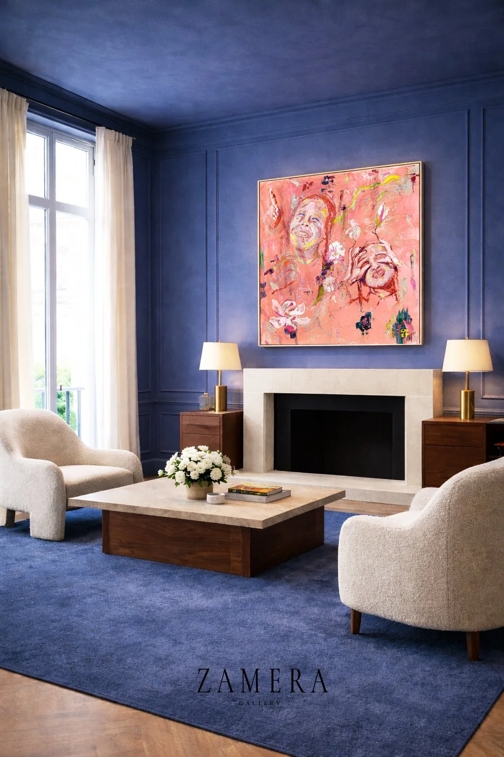
When Blue Meets Orange
The room reveals itself through contrast.
Deep navy walls—contemplative, grounding, almost meditative—wrap the space in quiet depth. Subtle panel molding creates architectural rhythm. The eye settles. Breath slows.
Then: the painting.
Orange Burst advances with warmth—coral, tangerine, and peach layered through gestural movement. Expressive faces emerge, joyful and unguarded. The brushwork carries momentum. Nothing feels static.
This is not decorative accident.
This is complementary color theory as emotional architecture.
The Physics of Contrast
Orange and blue sit opposite on the color wheel. Through proximity, they intensify one another.
The blue recedes—creating depth and atmosphere.
The orange advances—commanding presence without aggression.
Where Verdant Joy was held within tonal harmony, Orange Burst thrives against opposition. The cool envelope does not compete; it establishes the conditions for the painting to radiate.
Color moves outward from the artwork.
The room becomes frame.
The painting becomes presence.
Anchored Warmth
A limestone fireplace grounds the composition—its mineral softness bridging cool and warm without mimicking either. Brass table lamps emit quiet pools of light, their glow creating subtle dimensionality across the canvas.
The furnishings recede—cream bouclé, walnut wood, white florals—each element restrained, each aware of its role.
The indigo carpet mirrors the walls, creating chromatic continuity that allows the vertical composition—wall to artwork to ceiling—to read as a single architectural gesture.
Everything supports. Nothing competes.
Joy, Calibrated
If Verdant Joy represents the joy of becoming—gentle, hopeful, emerging—then Orange Burst embodies the joy of being: present, expressed, fully alive.
The entrance prepares.
The living room celebrates.
Orange carries inherent warmth—linked to vitality, creativity, and connection. Against the contemplative blue, it does not shout. It glows.
The tension between cool restraint and warm expression creates a space that feels alive without feeling restless.
This is joy calibrated for adult life—confident, grounded, enduring.
The Emotional Sequence
Consider the journey.
You arrive home. Verdant Joy greets you at the threshold—soft greens, tender pinks, the promise of renewal. The noise of the outside world begins to fall away.
You move deeper. The living room opens. Orange Burst draws you forward—warm, vital, celebratory. The quiet promise of arrival blossoms into full presence.
Two paintings.
One chromatic arc.
A complete emotional experience.
Design Notes
Wall Treatment
The saturated navy—tempered with subtle gray undertones—creates maximum contrast while maintaining sophistication. A matte finish absorbs light, deepening atmosphere.
Lighting
Layered illumination—natural daylight balanced with warm ambient lamps—prevents flatness and enhances dimensionality. The brass frame acts as a chromatic bridge between warm artwork and cool walls.
Scale
The artwork occupies approximately one-third of the wall’s vertical height—authoritative without overwhelming. Positioned at traditional picture height, it commands attention while maintaining balance.
Material Dialogue
Limestone, walnut, brass, and bouclé provide texture without visual noise. The palette remains disciplined so the artwork retains primacy.
When Art Becomes Atmosphere
This is not a painting placed within a room.
It is a room calibrated around a painting.
The indigo envelope establishes depth. The artwork punctuates it with warmth. Together, they orchestrate how the space feels—not just how it looks.
A living room is where life gathers. Conversation deepens. Connection unfolds.
Orange Burst does not simply occupy the space—it activates it.
Joy becomes ambient.
About Color Envelope
Color Envelope is an ongoing exploration of how chromatic environments shape emotional experience in residential interiors. Each study examines a spatial moment where color, light, and art converge to create atmosphere—not decoration.
Study 01: Verdant Joy — an entrance exploring renewal and threshold.
Study 02: Orange Burst — a living room exploring vitality and warmth.
Availability

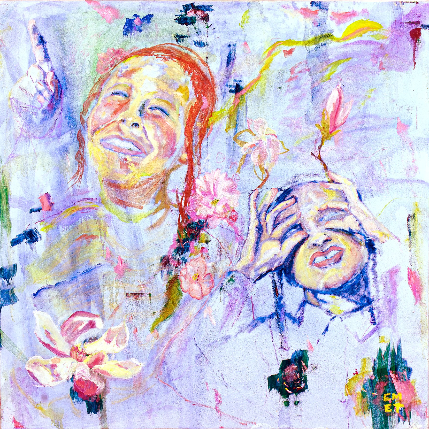

Adar — Orange Burst is available as a limited edition giclée on archival canvas.
Professional framing and placement consultation available upon request.
For interior professionals, we offer custom color collaboration to ensure seamless integration within your project palette.
Zamera Journal
Art. Space. Meaning.
Adar – A Celebration of Joy and Purity
This painting captures the boundless joy and purity of children, whose hearts remain untouched by the worries of the world. With their infectious smiles and bright eyes, they remind us of the beauty in simplicity and the constant joy that comes from seeing life with wonder and optimism. Each child in this piece embodies the spirit of Adar, the month of joy, when happiness and celebration fill the air.
Adar is a time when we are encouraged to amplify our joy, and through the eyes of these children, this painting brings that joy to life. Their innocent exuberance serves as a reminder that joy is not just a fleeting moment, but a way of being—a lens through which we can all choose to see the world.
In this work, I sought to portray not just their youthful energy, but the timeless wisdom that children have: to live fully in the present, to embrace each day with an open heart, and to find light in every corner of life. This piece is a tribute to the purity, joy, and hope that children bring into the world, especially during the uplifting month of Adar.
FREE SHIPPING
Each print is made-to-order by my printing partner on the highest quality canvas, trimmed to size, framed or not , and made ready just for you.
Choose Your Perfect Presentation
We offer four flexible options for displaying your artwork, allowing you to customize your purchase to suit your space and aesthetic preferences. All paintings are created on a high-quality 40"x40" canvas print that have the same look and feel as actual canvas , with the choice of two depth sizes and framing options to ensure the perfect fit for your home or office. Additionally, we offer the possibility to customize the size and frame to meet your specific needs.
Options:
Canvas Depth:
1.5 Inch Depth – A sleek, modern feel with a thinner profile.
Framing:
Gallery Floats Floater White or Black Frame – Add a touch of elegance with a crisp white float frame that subtly lifts the artwork, enhancing its visual presence while allowing the sides of the canvas to remain exposed.
Unframed – For a minimalist approach that highlights the raw beauty of the canvas with no additional borders.
Custom Orders:
Custom Size – If you have a specific size in mind for your space, we are happy to accommodate custom size requests to ensure a perfect fit.
Custom Frame – Want a different framing style or color? We offer custom framing options to match your vision.
Each option is crafted with care to reflect the highest standards of quality and artistic integrity, ensuring that your chosen piece will shine beautifully in your space. For custom orders, please contact us directly to discuss your preferences and we'll work with you to bring your vision to life .