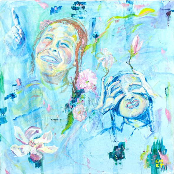
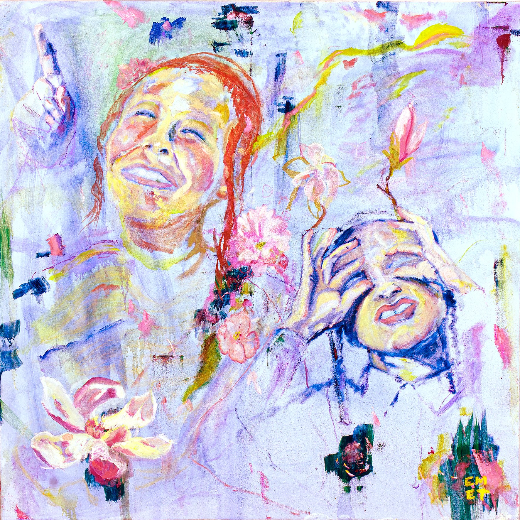
Color Envelope Study 03 — Adar
Violet Bliss
Color Envelope Series | Interior Architecture | Art & Spatial Emotion
A Dining Room Study in Ceremony and Radiance
There are dining rooms that host meals.
And there are dining rooms that hold emotion.
In this Color Envelope Study, Adar — Violet Bliss is not placed as decoration. It is installed as presence — calibrated, framed, and granted spatial authority.
A spatial study of Adar — Violet Bliss installed within a square architectural alcove.
This video explores how violet tones, warm metallic lighting, and controlled proportions transform a dining room into a field of chromatic presence.
The Architecture of Containment
The wall is conceived as a square alcove — precise, architectural, intentional.
A sage green frame defines the boundary. The proportions are deliberate: a perfectly square canvas demands vertical generosity. The ceiling rises beyond standard residential scale, allowing the artwork to remain square — not visually compressed, not competing with furniture lines.
Discreet cove lighting traces the upper perimeter. Light does not spotlight the painting. It breathes around it.
Light oak chevron flooring anchors the space in warmth. The credenza remains minimal, nearly recessive. The table is centered — calm, grounded, deliberate.
The architecture steps back.
The painting steps forward.
Violet as Atmosphere, Not Accent
Violet is often misunderstood as ornamental. Here, it becomes structural.
The palette of Violet Bliss — lavender, softened pinks, warm peach, restrained golden yellow — creates a chromatic vibration that shifts the perception of the room itself.
Violet expands.
Peach advances.
Yellow flickers.
The room does not merely contain the painting. It absorbs its wavelength.
Walls remain mineral, soft, slightly warm, allowing saturation to read as luminous rather than loud. The sage alcove contains without constraining, permitting the violet to radiate rather than impose.
This is not contrast for spectacle.
It is calibration for resonance.
The Chandelier as Counterpoint
Above the table, twin sculptural brass chandeliers — clustered amber glass spheres — introduce a second chromatic register.
Warm metallic glow meets cool violet frequency.
The result is tension — refined, controlled, luxurious.
The fixtures flank the composition rather than dominate it. Brass echoes brass. Light converses with color.
They do not compete.
They complete.
The Gathering as Composition
Ten jewel-toned chairs — emerald, sapphire, burgundy, cream — surround the table. Each contributes a tonal note without overwhelming the palette. The effect suggests curation over coordination.
A sage area rug grounds the composition, echoing the alcove frame and unifying the space beneath.
Fresh florals in cream soften the geometry. Potted greenery flanks the alcove, introducing organic transition between architecture and atmosphere.
Everything understands its role.
Dining as Ceremony
A dining room is a space of gathering — voices overlapping, memory forming in real time.
Within an architectural square, Adar — Violet Bliss becomes more than imagery. It becomes backdrop to ritual — Shabbos meals, Purim celebrations, quiet weekday dinners where joy accumulates gradually.
Joy does not arrive loudly.
It emerges through light, proportion, and chromatic intention.
The painting anchors emotional elevation.
The architecture frames it.
The color activates it.
The gathering completes it.
When Art Becomes Infrastructure
This study proposes a reconsideration:
What if color is not applied — but embedded?
What if the room does not display the painting — but extends it?
What if joy is not staged — but spatially calibrated?
When chromatic environment, proportion, and emotional intention align, the result is not decoration.
It is transformation.
About Color Envelope
Color Envelope is a long-term design research project examining color as an architectural force within residential space.
Rather than treating art as an applied element, each study positions the artwork as generator — allowing proportion, enclosure, materiality, and light to respond in dialogue.
The focus is not decoration.
It is spatial calibration.
Each chapter isolates a condition — threshold, gathering space, dining room — and studies how chromatic structure reshapes perception and emotional tone.
Color becomes envelope.
Envelope becomes atmosphere.
Atmosphere becomes experience.
Adar
I — Threshold
II — Vitality
III — Presence
Adar — Violet Bliss is available as a limited edition giclée print in multiple sizes.
Inquire for designer specifications and trade pricing.